Building the Fusion Energy. Brand Refresh + Creative System.
Livermore Fusion SC engaged Launch Original to develop a refreshed brand direction and digital creative system for the club. The work focused on elevating the existing Livermore Fusion identity while creating a stronger, more consistent visual language for social media, website use, club communications, and future marketing campaigns.
The final creative direction introduced the “Element of Success” concept, using energy, movement, chemistry, and player development as the foundation for a bold new brand system.
Launch Original was brought in to help Livermore Fusion modernize the way the club shows up across digital platforms. The project included brand refinement, campaign messaging, color and typography guidance, localized design inspiration, social media templates, and a full creative framework that the club could use across multiple touchpoints.
The original scope included a brand book and guidelines, social media templates, digital asset management, website review, social media management, and ongoing site support. The brand work was designed to connect the club’s existing identity with a more dynamic and professional presentation.
Livermore Fusion already had an established crest, color palette, and community presence, so the challenge was to evolve the brand without losing what made it recognizable.
The creative needed to feel modern, athletic, and engaging for youth soccer families while still respecting the club’s history and local identity. It also needed to be practical enough for daily use across social media, player announcements, coach features, tryouts, events, and general club communications.
Another key challenge was building a system that could feel premium and energetic without drifting too far away from the club’s existing brand foundation.
The main objective was to create a refreshed visual and messaging system that gave Livermore Fusion a more confident and consistent digital presence.
Launch Original set out to:
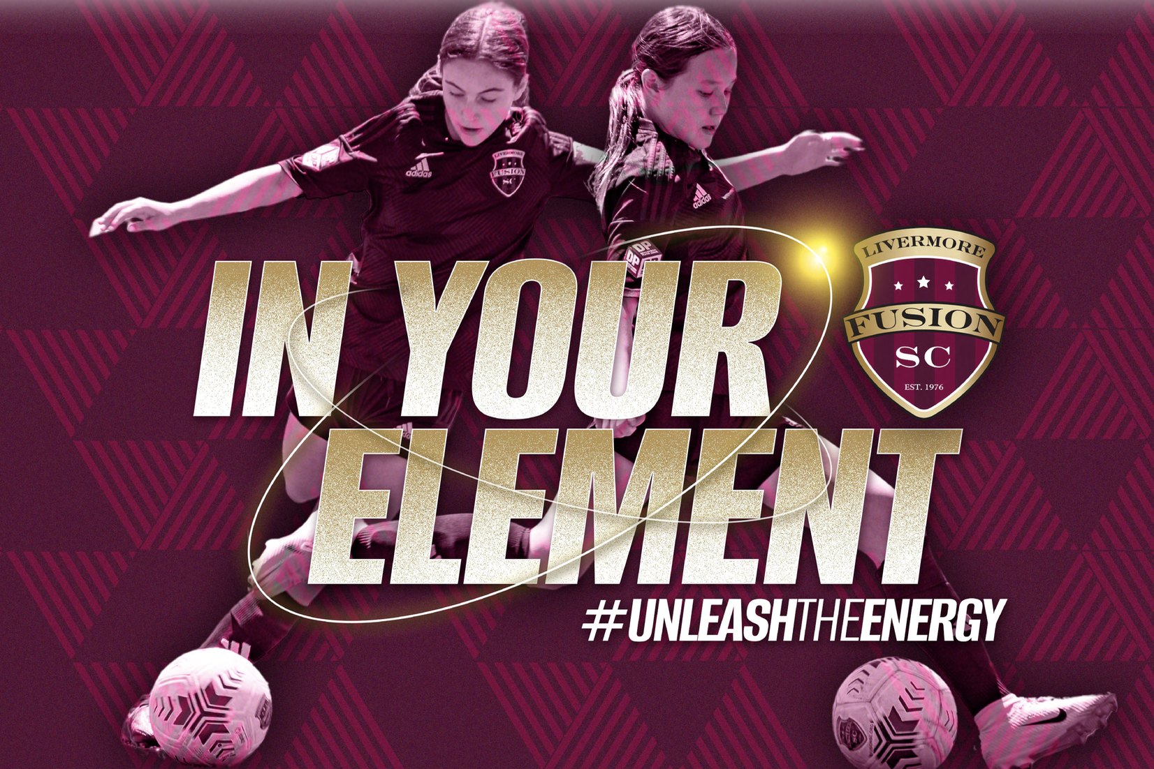
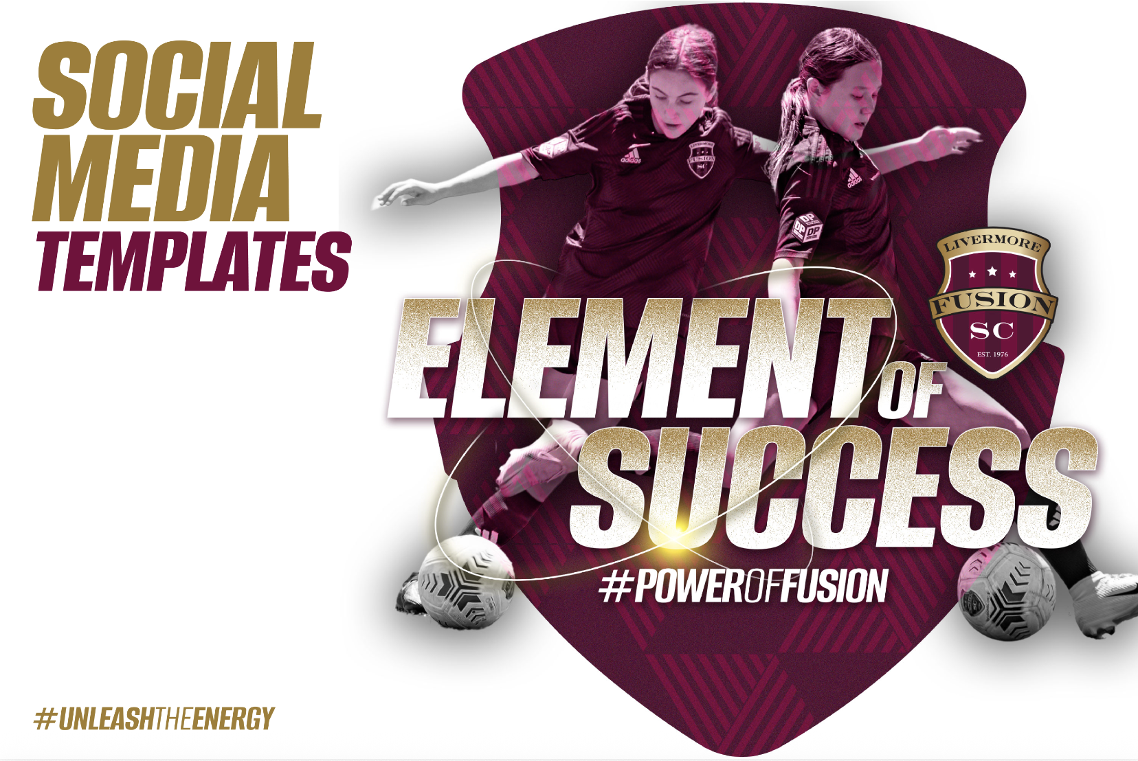
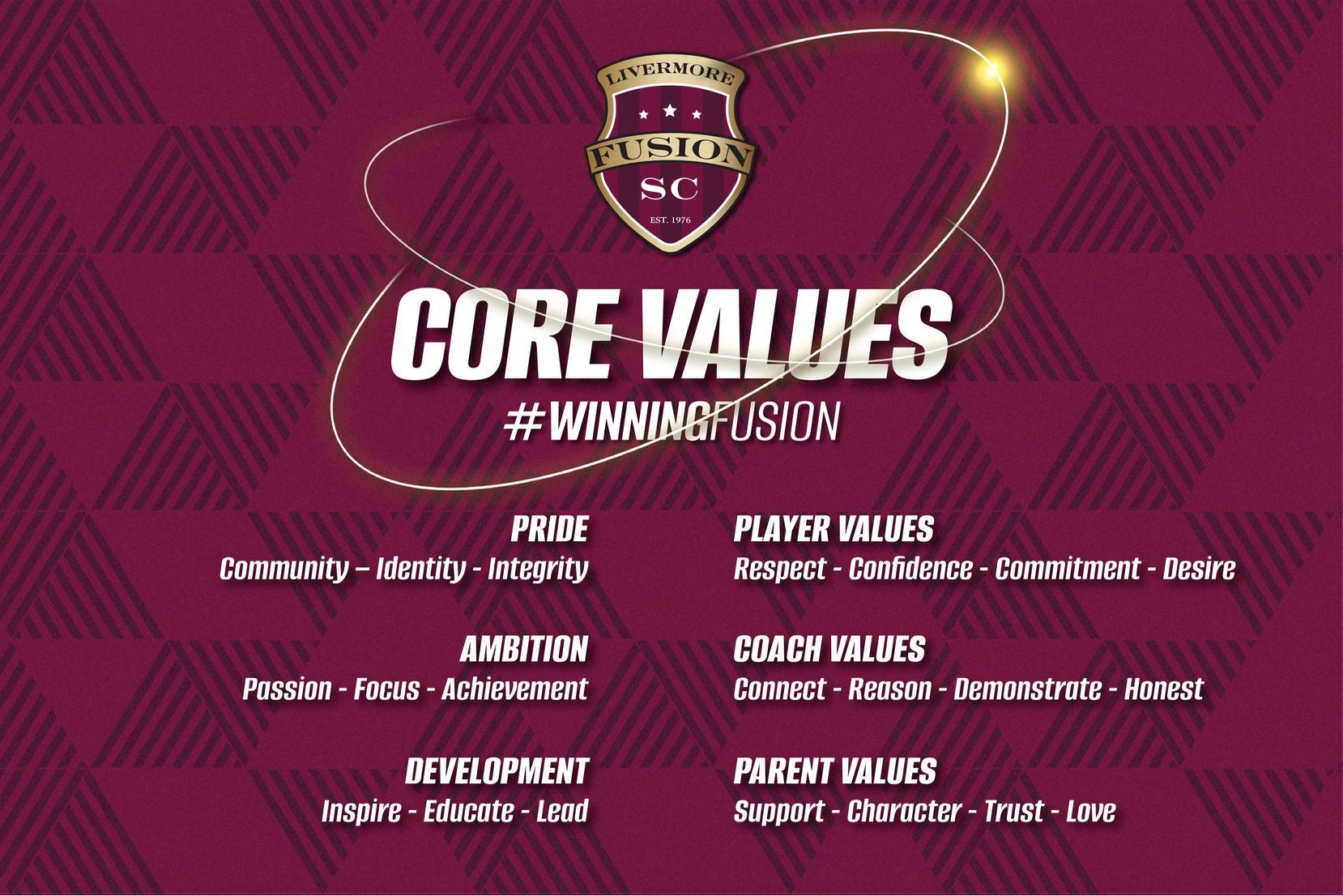
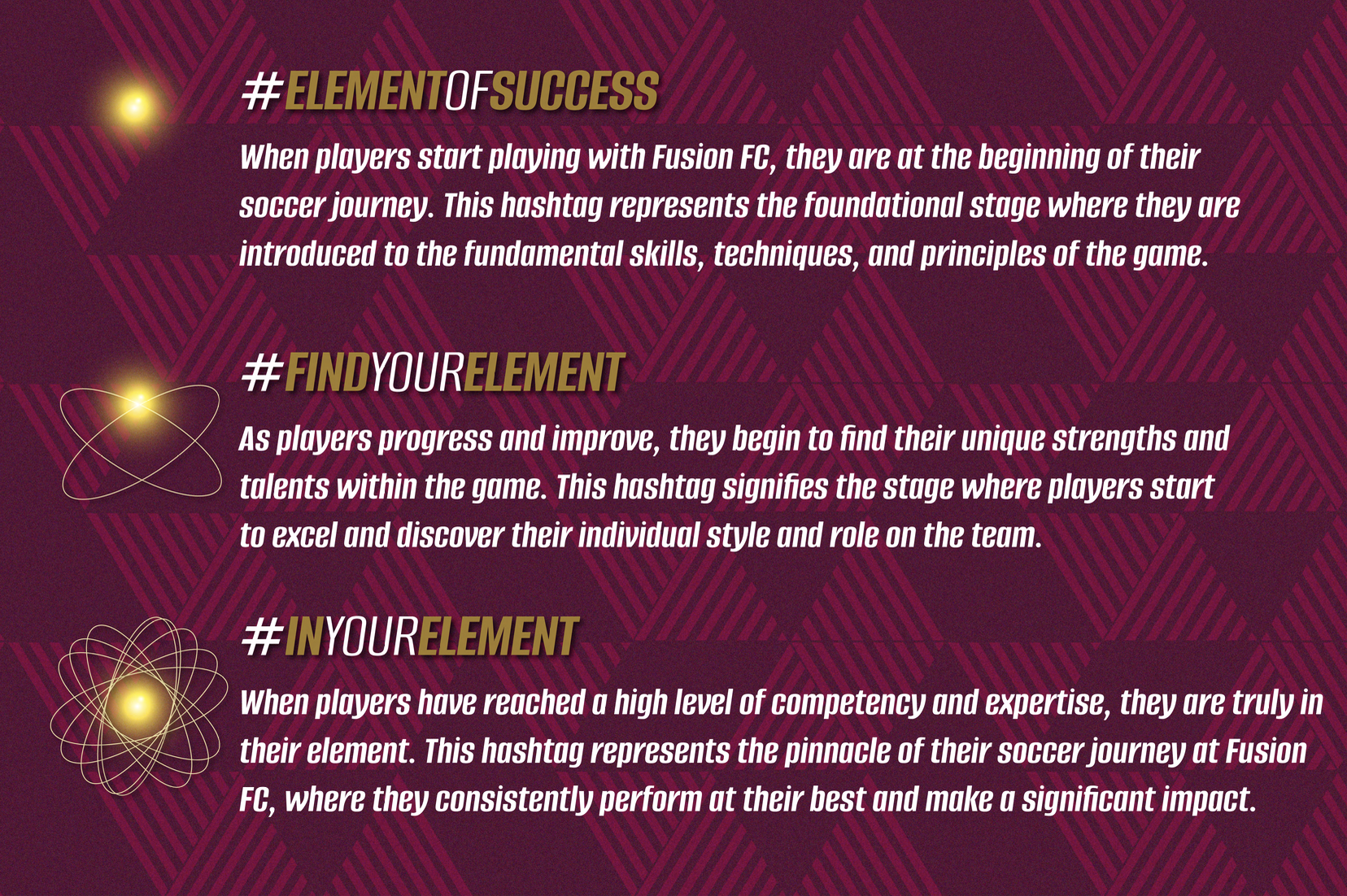
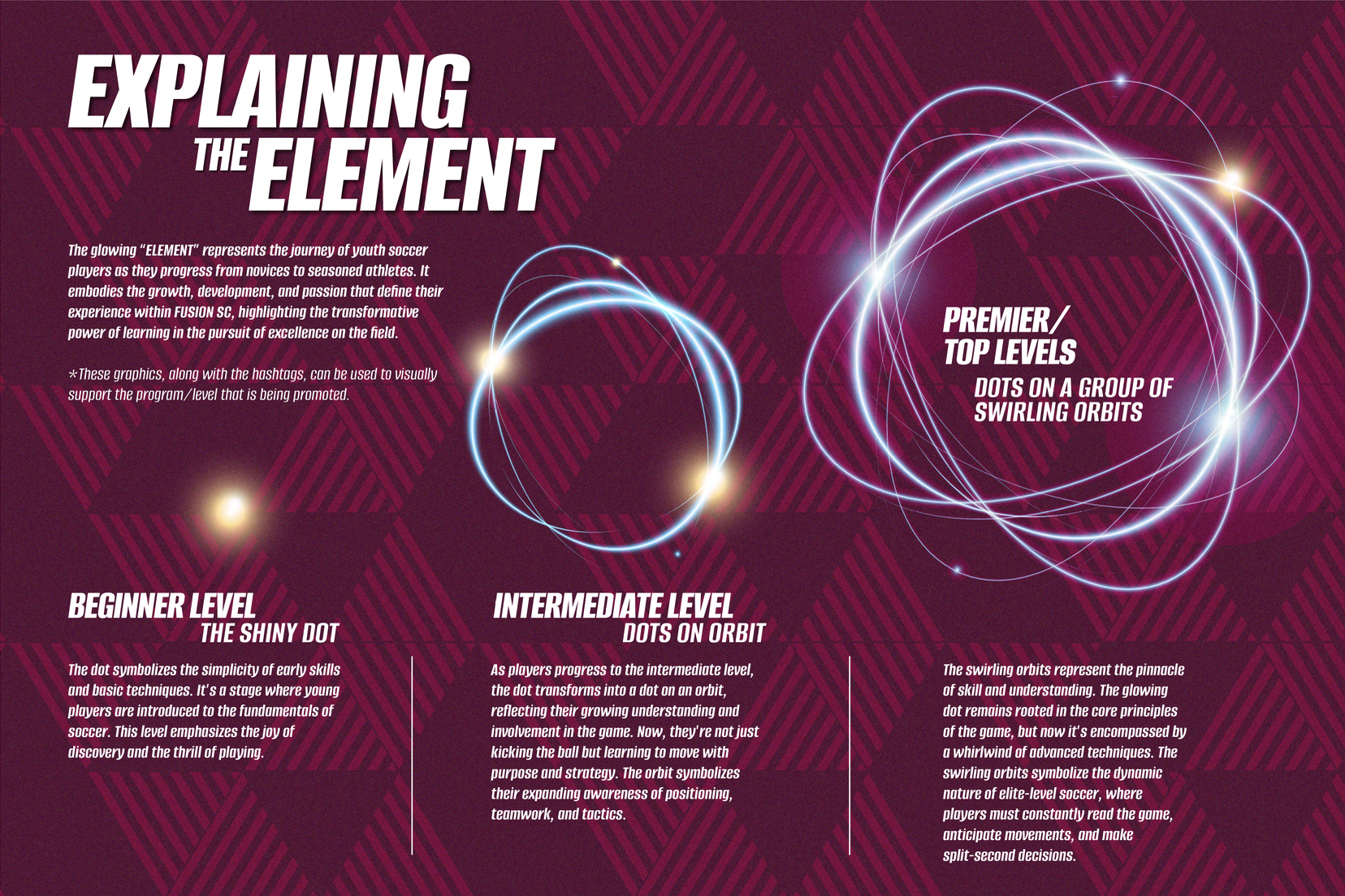
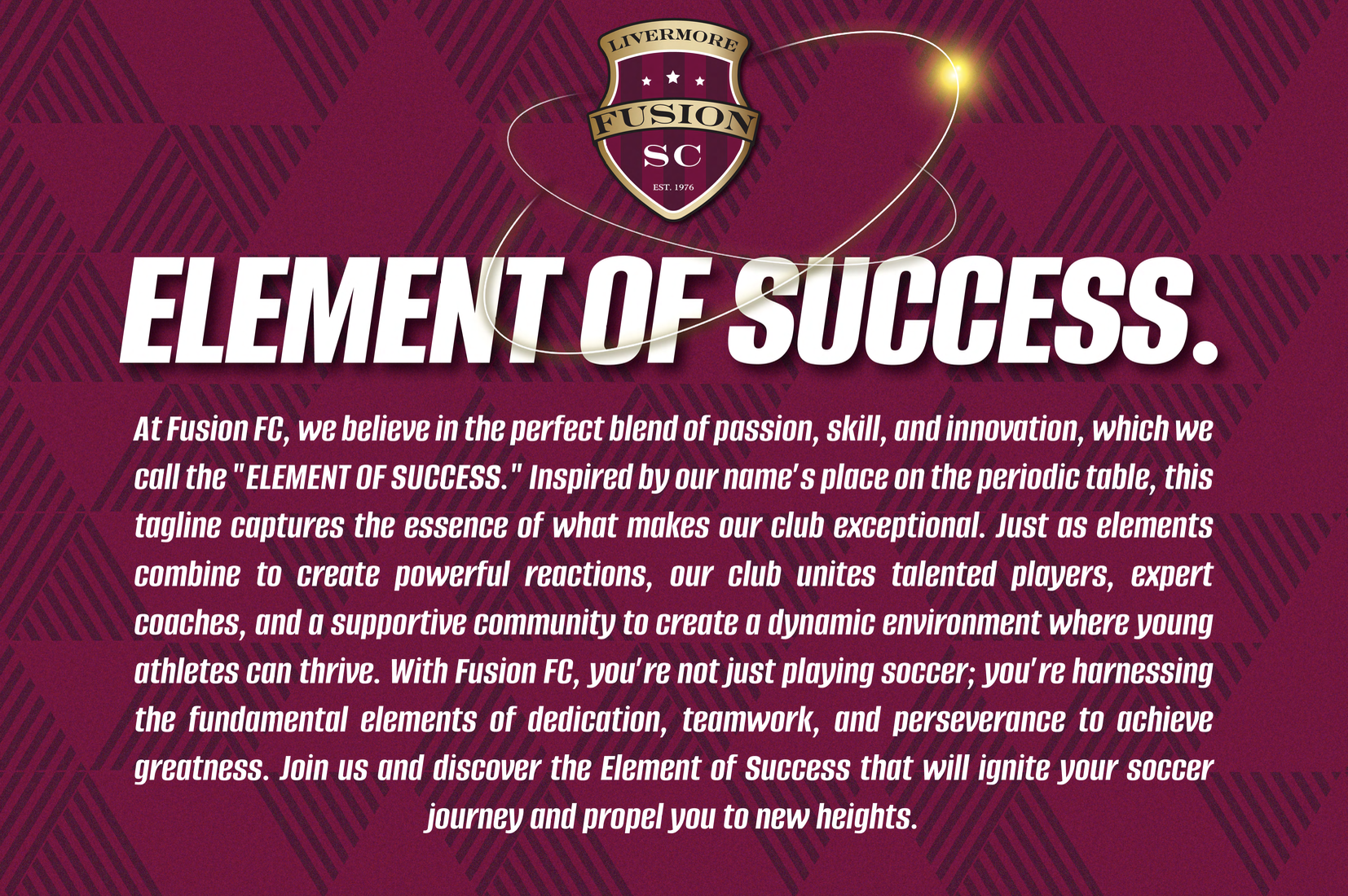
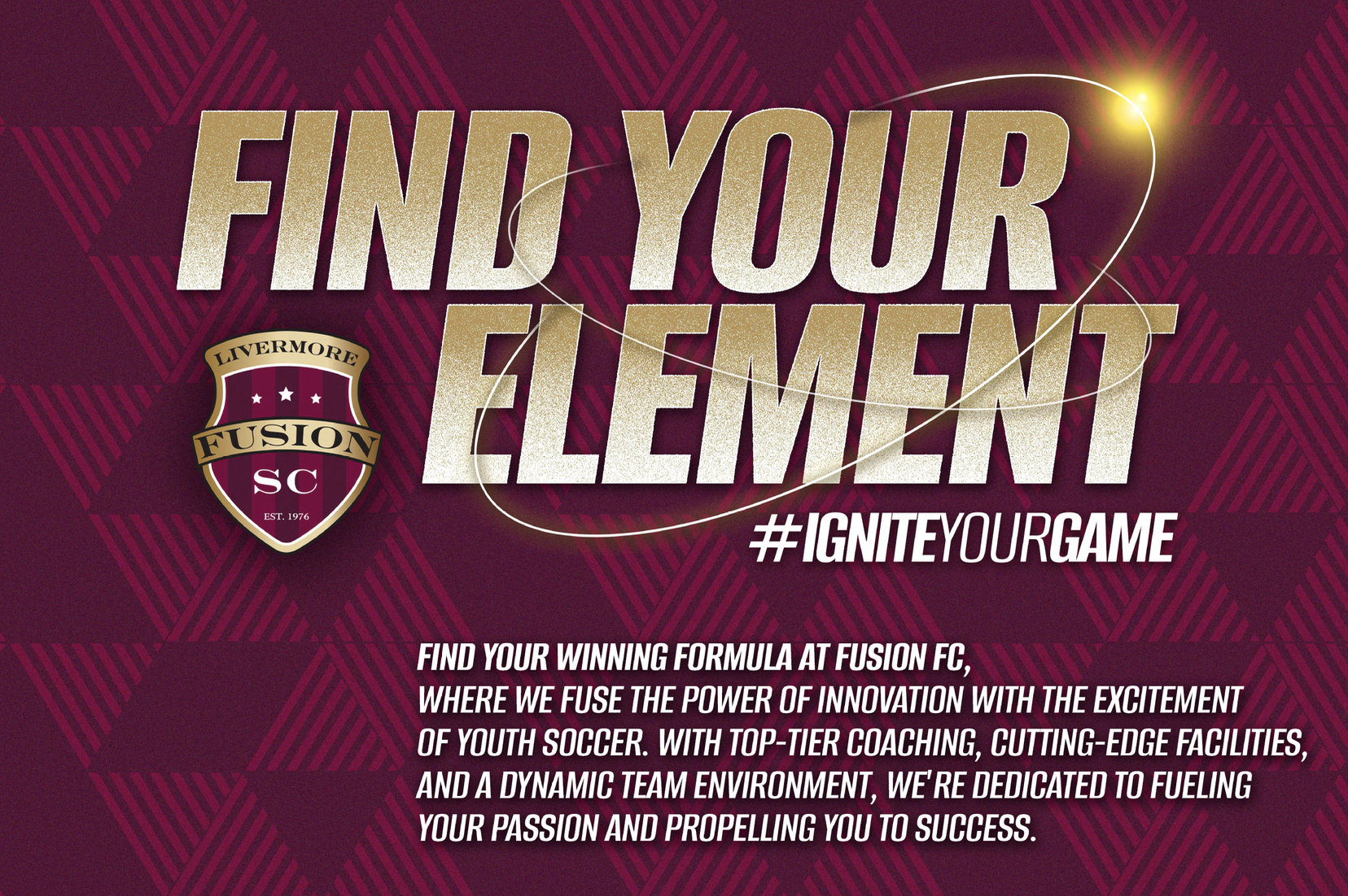
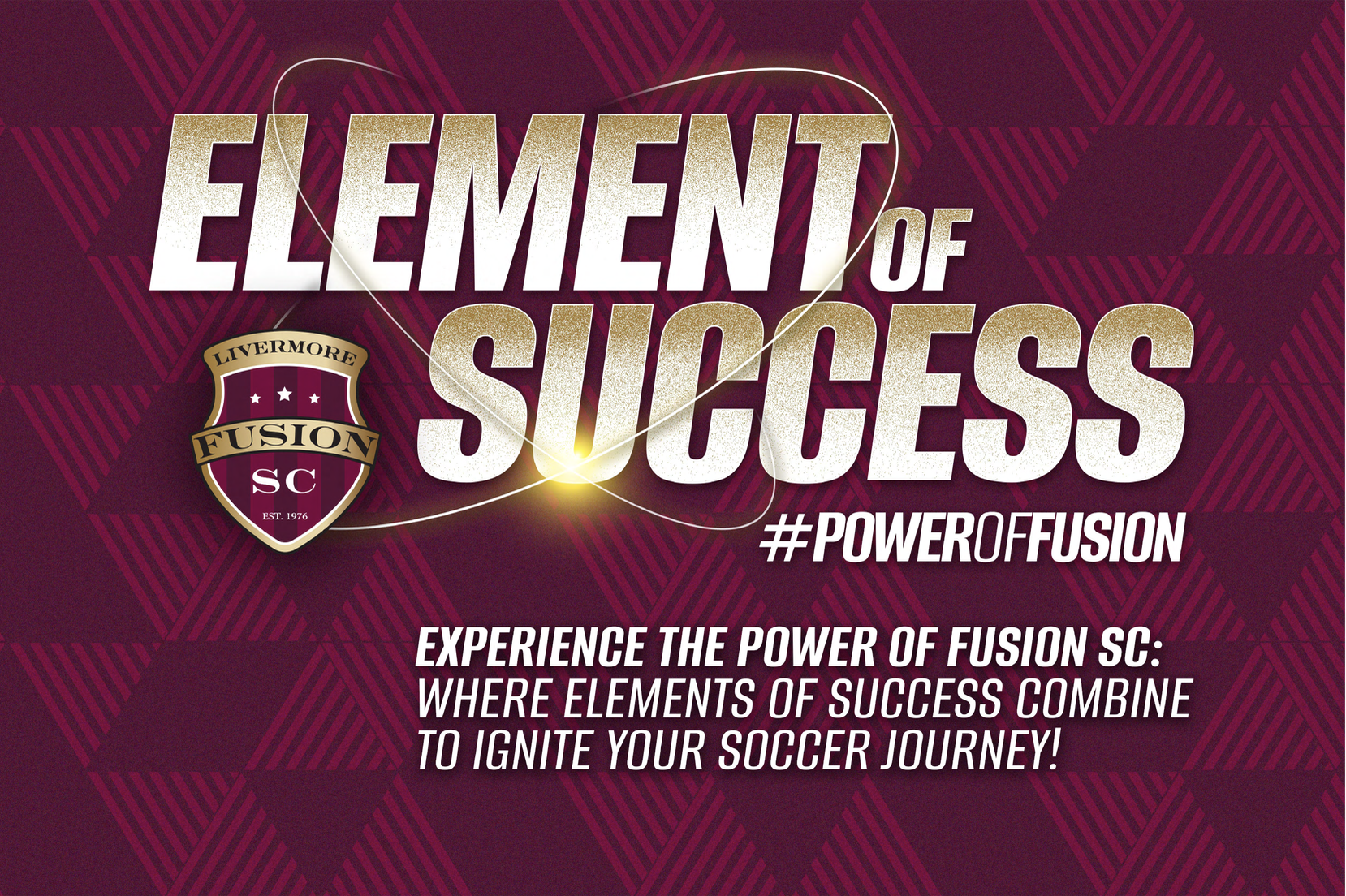
The final brand direction centered around the “Element of Success” campaign. This concept connected the Fusion name to the idea of energy, chemistry, progression, and performance.
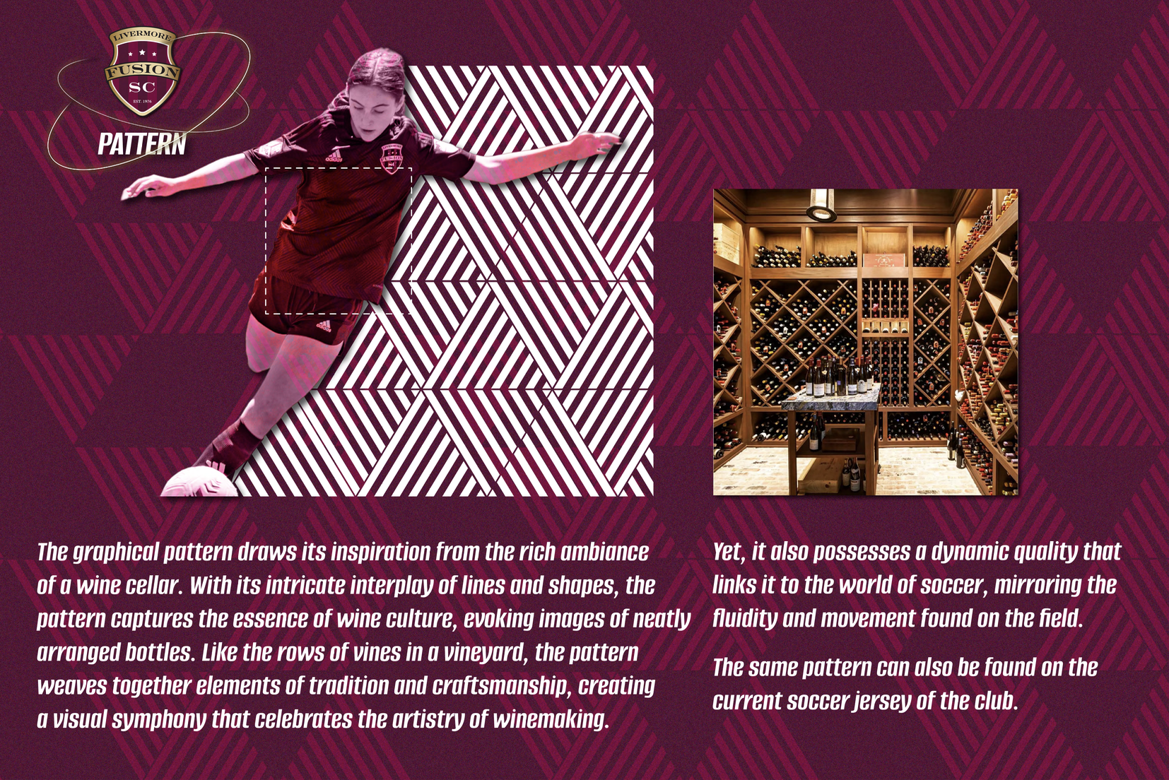
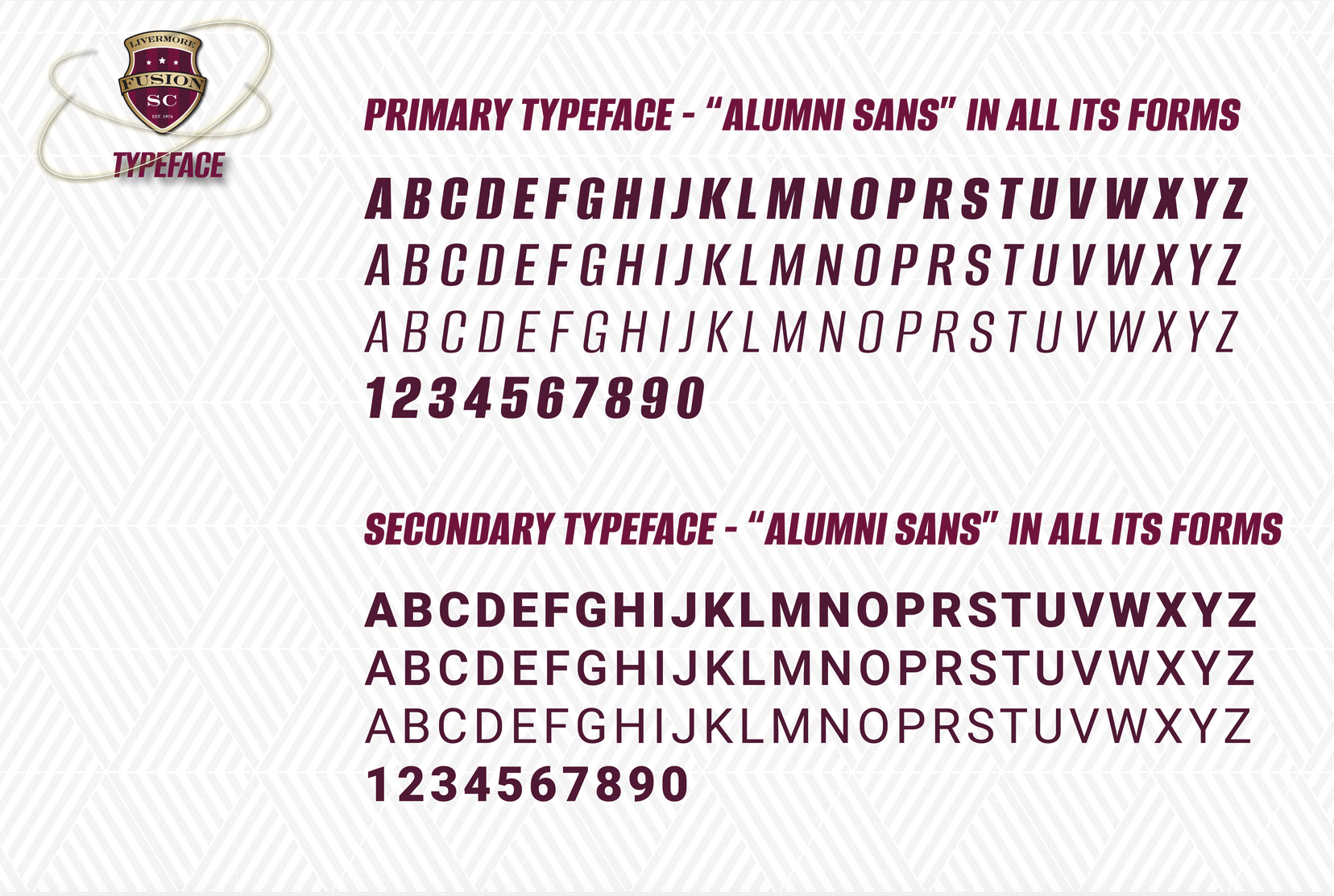
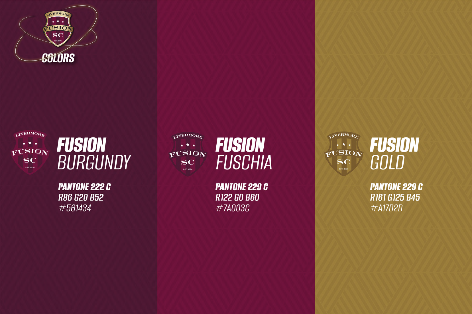
The finished system included a refined color palette featuring Fusion Burgundy, Fusion Fuchsia, and Fusion Gold, along with bold typography, orbit-inspired graphics, energetic player imagery, and a custom pattern system inspired by Livermore’s wine-country culture.
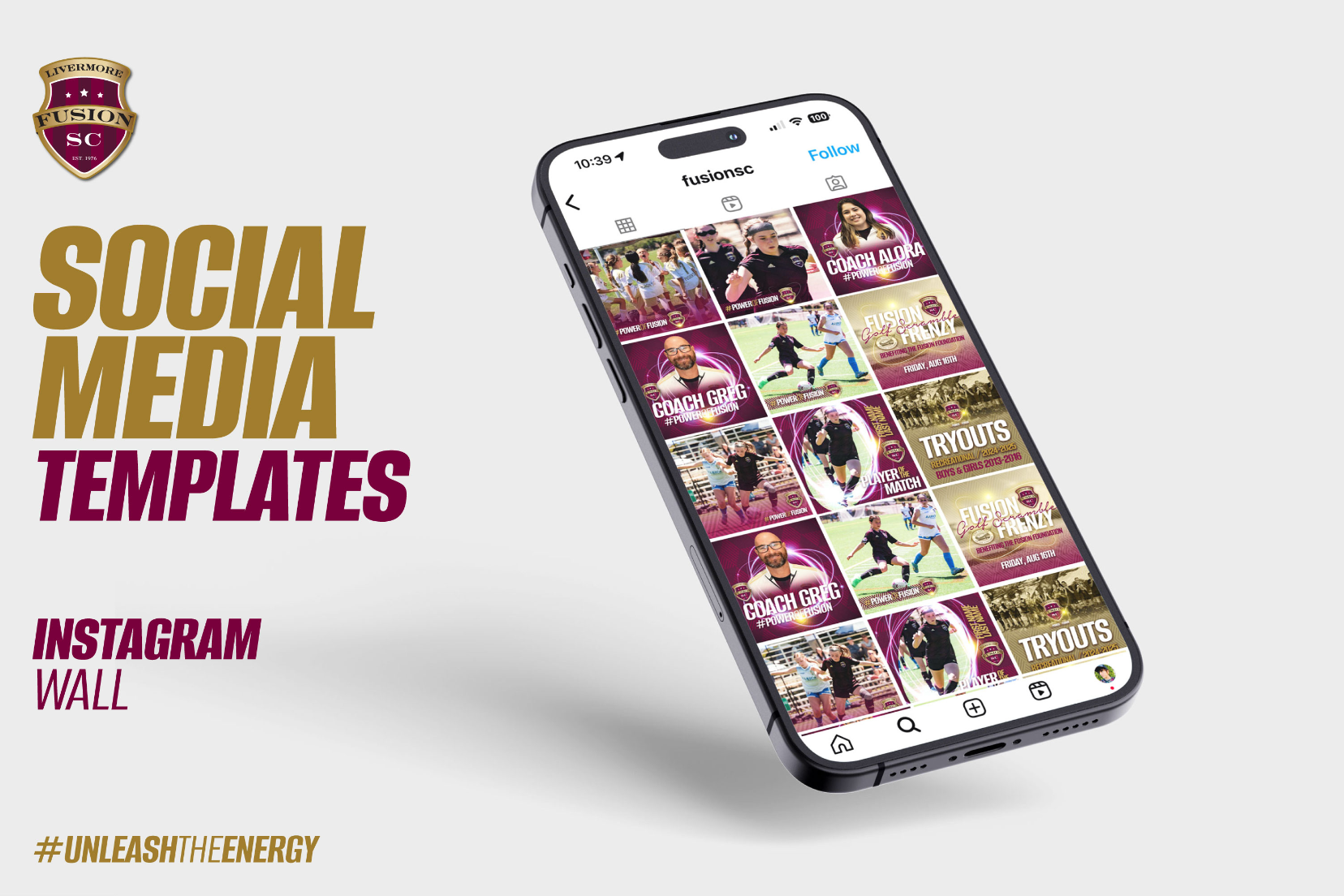
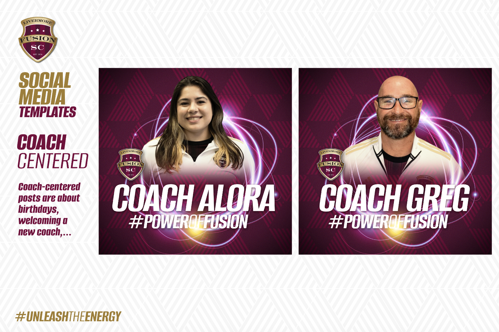
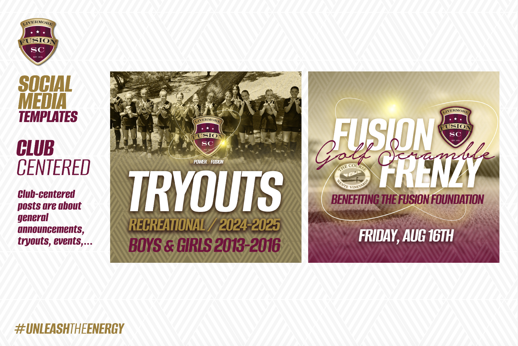
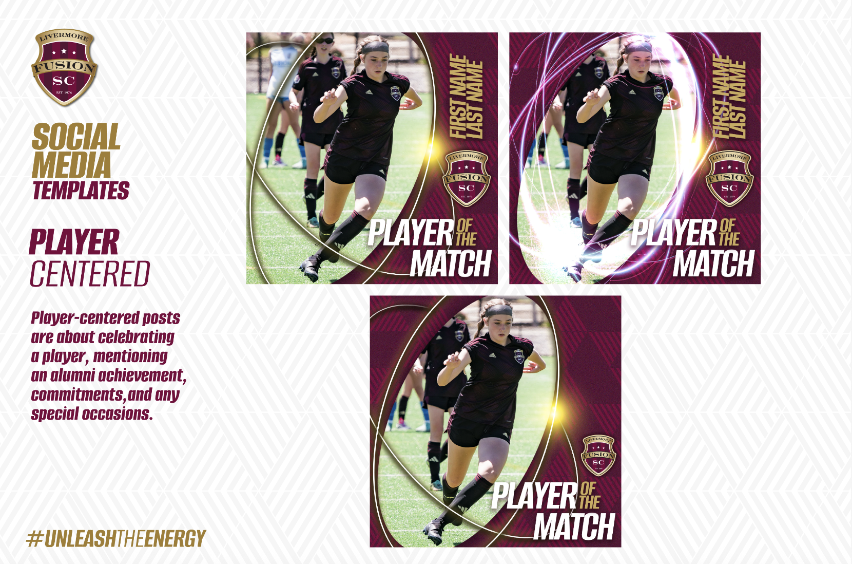
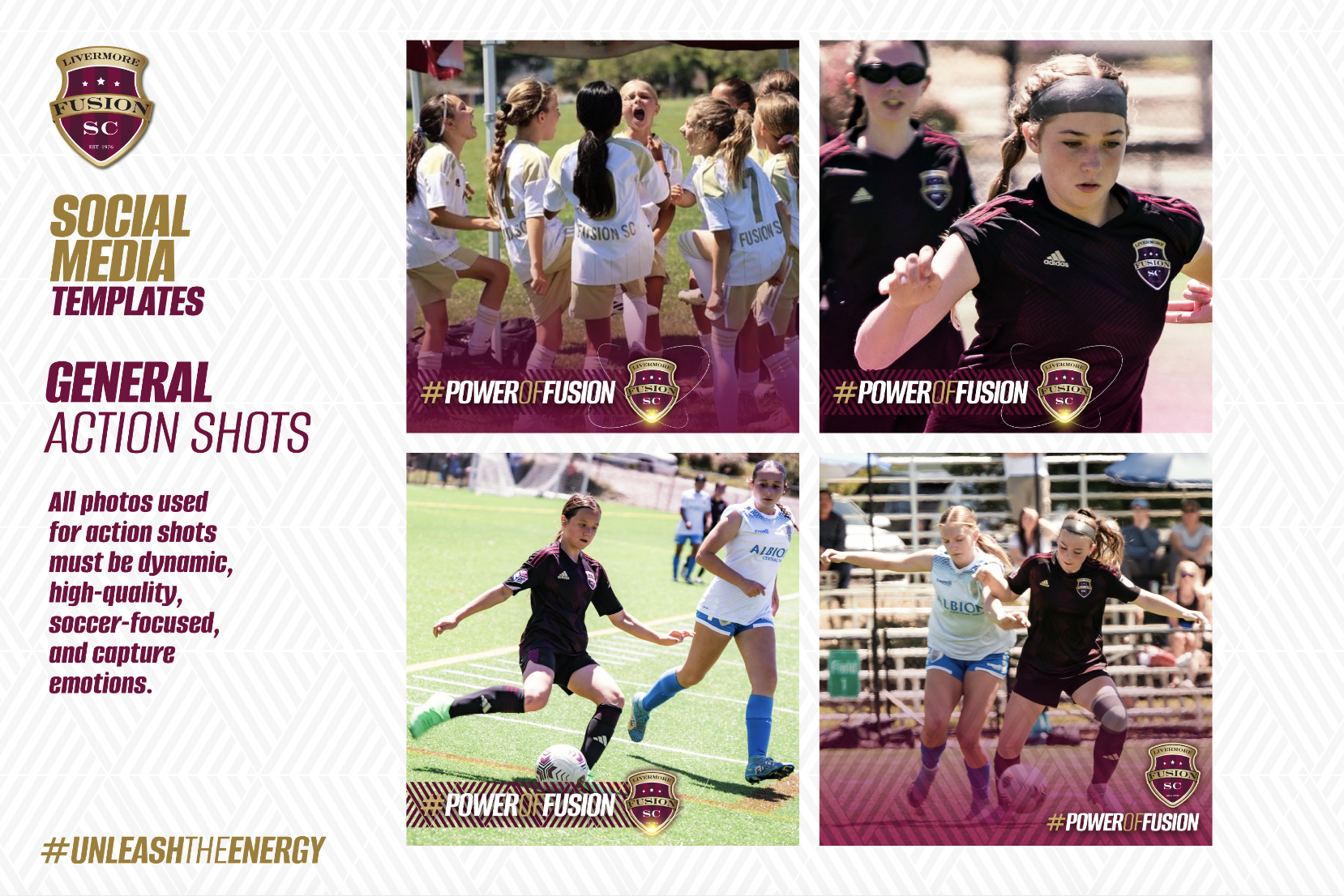
Launch Original also created a complete social media template suite, including action posts, player-centered graphics, club announcements, coach features, event promotions, tryout graphics, and Instagram wall examples.
The result was a stronger, more modern brand presence for Livermore Fusion SC. The club received a flexible creative platform that honored its existing identity while giving it the tools to show up with more clarity, consistency, and impact across every digital channel.