Brand Identity + Creative System.
LA Surf Soccer Club partnered with Launch Original to develop a complete brand guideline system that could unify the club’s visual identity across programs, regions, events, social media, merchandise, and digital campaigns.
The project established LA Surf as “The Strongest Soccer Club in Los Angeles” and built a creative platform around the club’s mission to create best-in-class experiences and opportunities for youth soccer players through its clubs, events, and facilities.
Launch Original created a full LA Surf brand book designed to give the club a clear, scalable, and professional identity system. The work included logo usage, brand colors, typography, gradients, textures, brand elements, taglines, event branding, social media templates, collateral, merchandise, and campaign examples.
The creative direction centered around the Surf wave and a fingerprint-inspired brand element. This visual system connected the idea of movement, identity, and impact, giving LA Surf a flexible design language that could live across everything from Instagram graphics and event signage to apparel, printed materials, and website campaigns.
The brand guide also introduced a clear structure for how the LA Surf identity should appear across grassroots, competitive, and elite programming, allowing the club to maintain consistency while still creating variation for different audiences and events
LA Surf operates across multiple regions, programs, and competitive levels, which created a need for a brand system that could feel unified without becoming repetitive or overly rigid.
The challenge was to create one recognizable LA Surf identity that could support a wide range of use cases, including club announcements, tryouts, game schedules, player features, college nights, tournaments, formal events, merchandise, and digital campaigns.
The brand also needed to feel modern, athletic, and Los Angeles-driven while staying connected to the Surf name, the wave mark, and the larger club mission. The final system had to be bold enough for social media, polished enough for corporate and event collateral, and flexible enough for daily use by the club’s creative and operations teams.
The main objective was to create a complete, practical, and visually powerful brand system for LA Surf Soccer Club.
Launch Original set out to:
Launch Original delivered a comprehensive LA Surf brand guideline system that gave the club a stronger, more consistent, and more elevated identity across every platform.
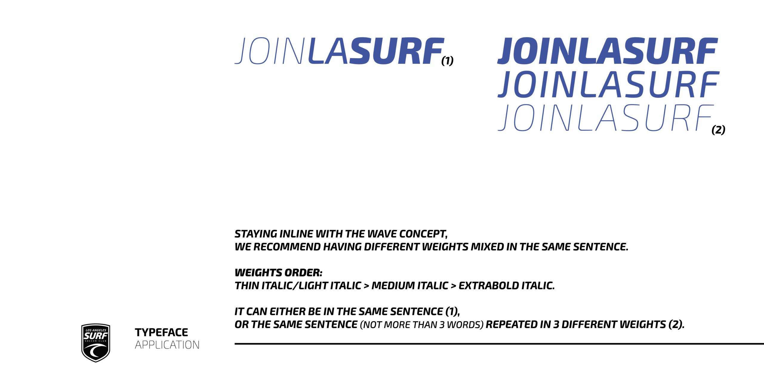
The final brand system included Surf Blue, rich black, cool grays, cyan, and purple as core and accent colors, paired with Exo 2 as the primary typeface to create a clean, modern, and energetic visual style.
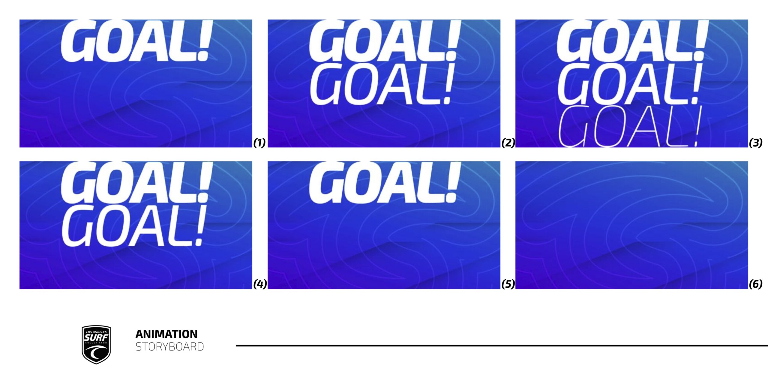
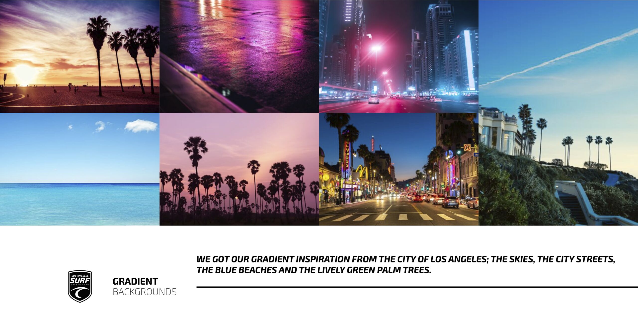
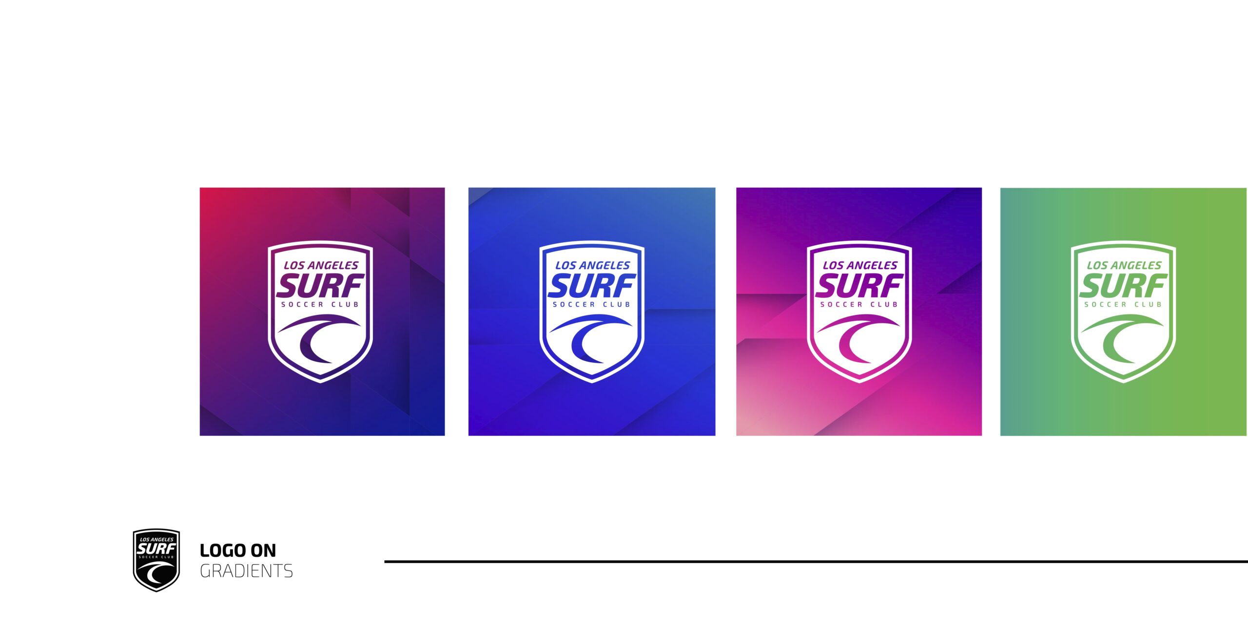
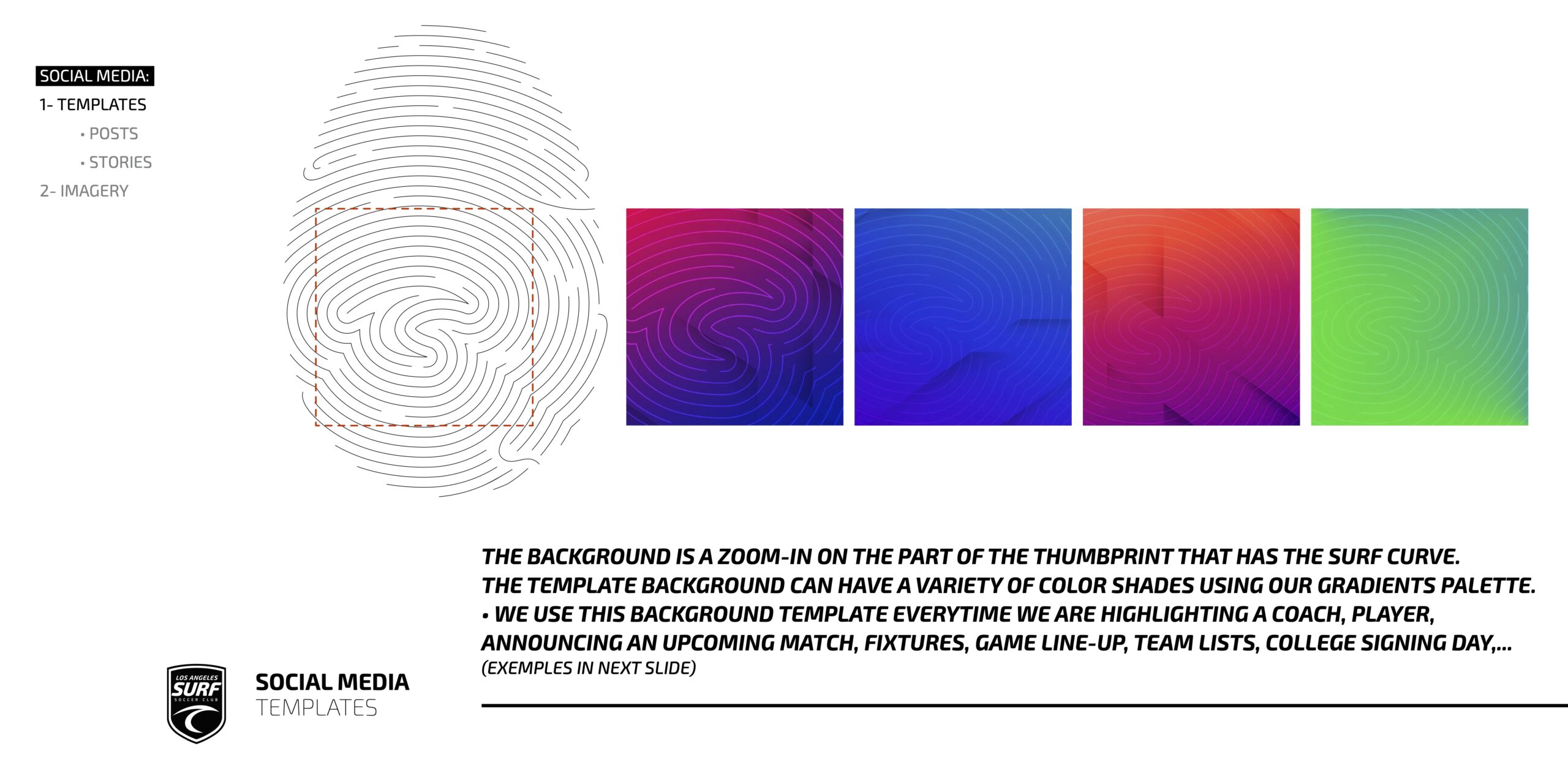
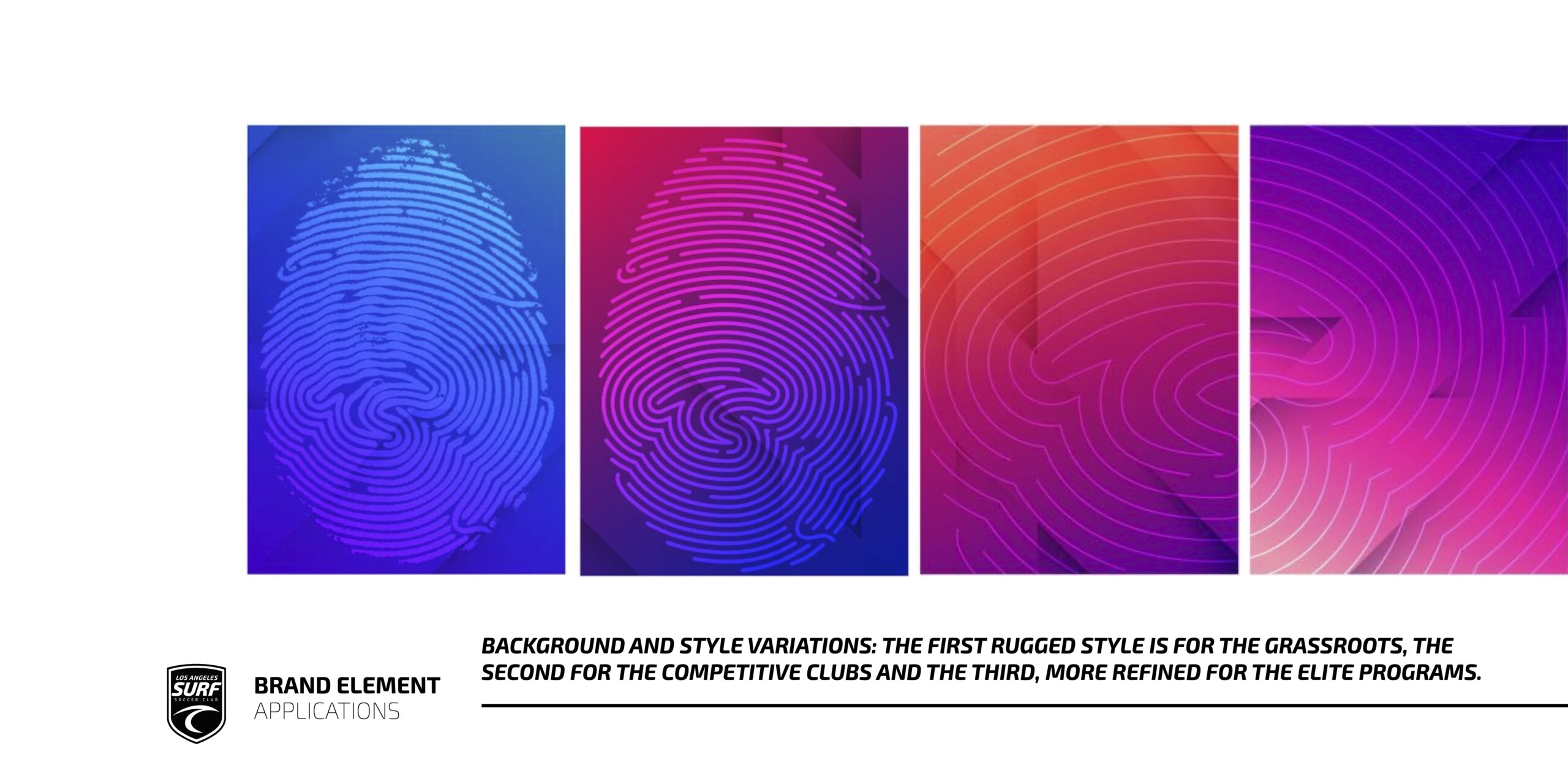
The creative direction introduced vibrant gradient backgrounds inspired by Los Angeles, including the city skies, streets, beaches, and palm trees. These gradients helped create a bold and dynamic digital look that felt specific to the LA market.
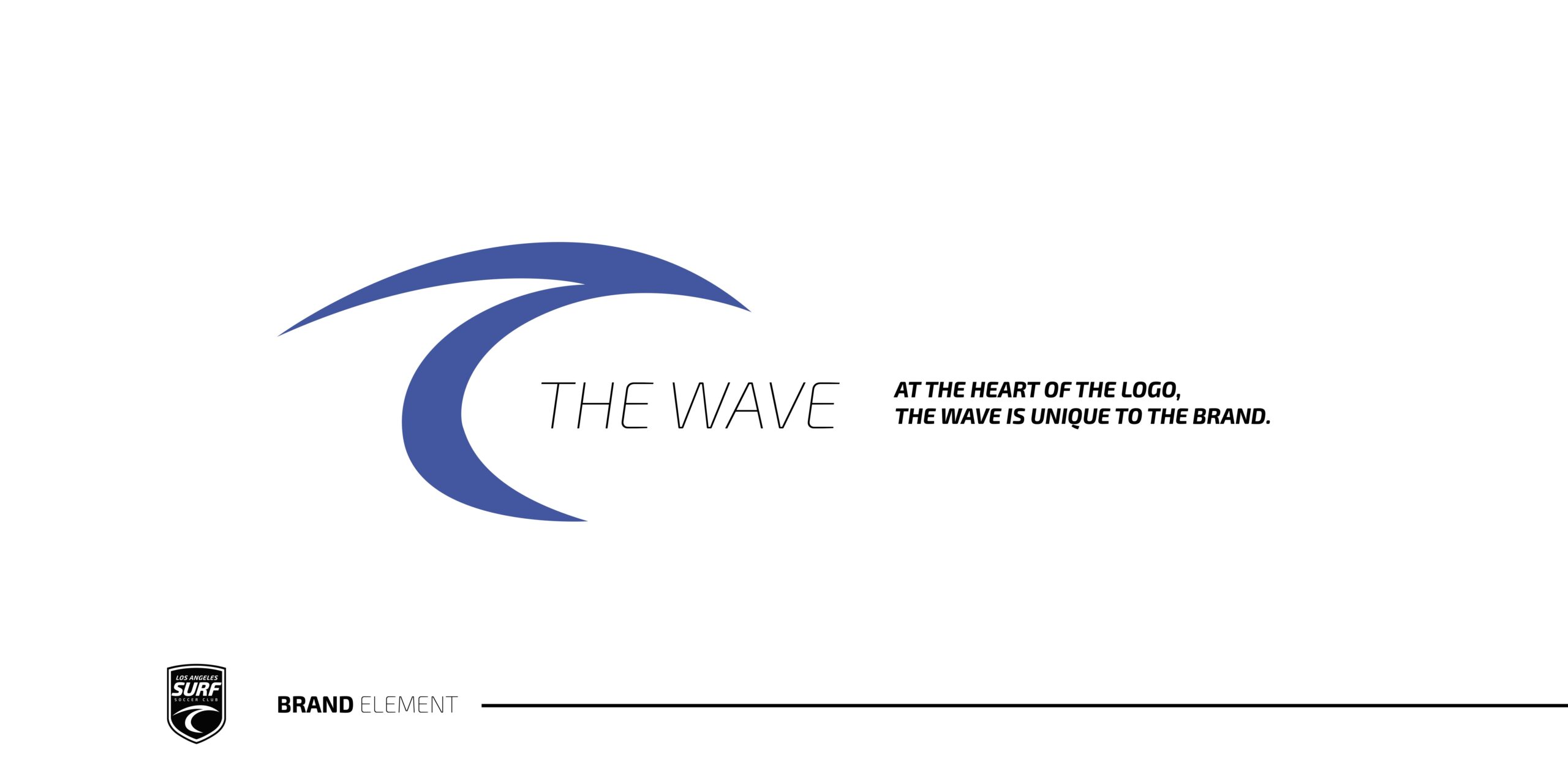
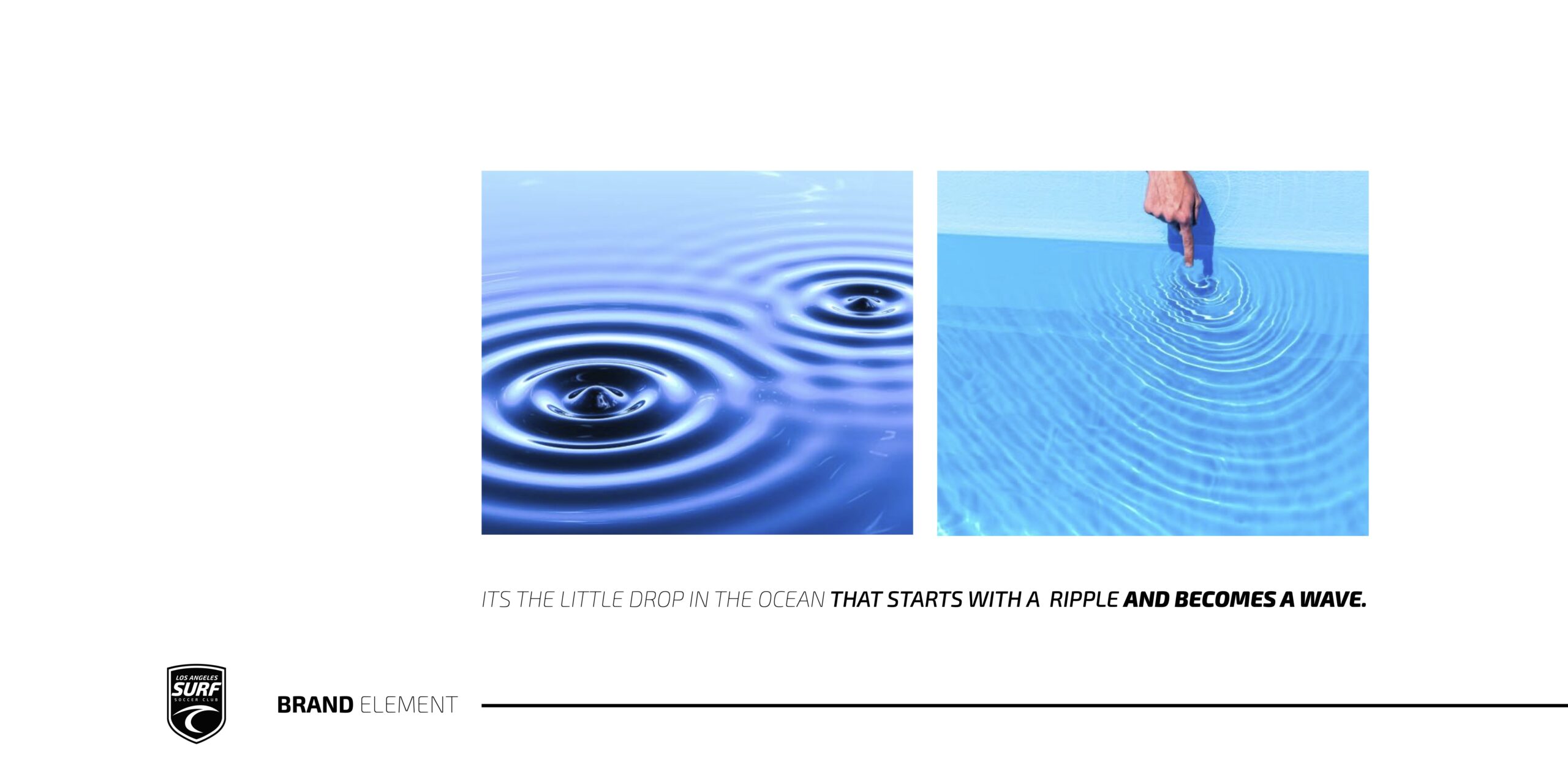
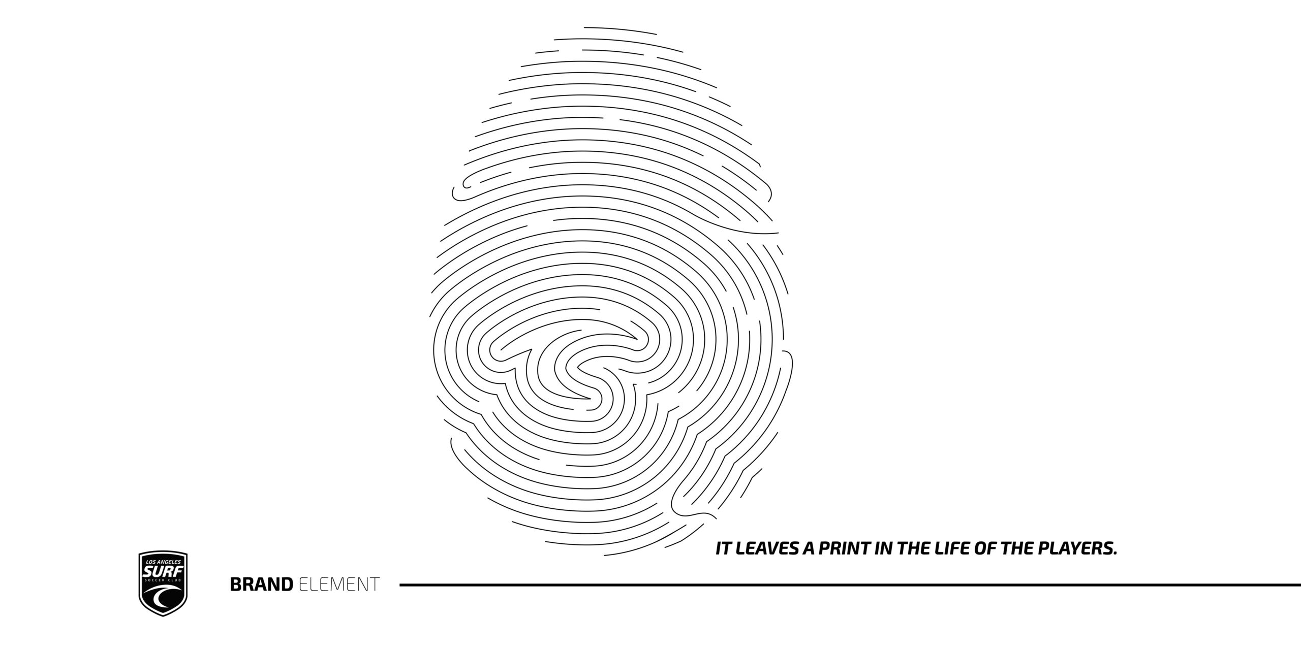
The wave and fingerprint system became the central brand element. It represented the idea that every player starts as a small ripple and grows into a wave, leaving a lasting mark through the club experience. This concept supported key taglines such as “Make A Mark,” “Leave A Mark,” and “Mark Made.”
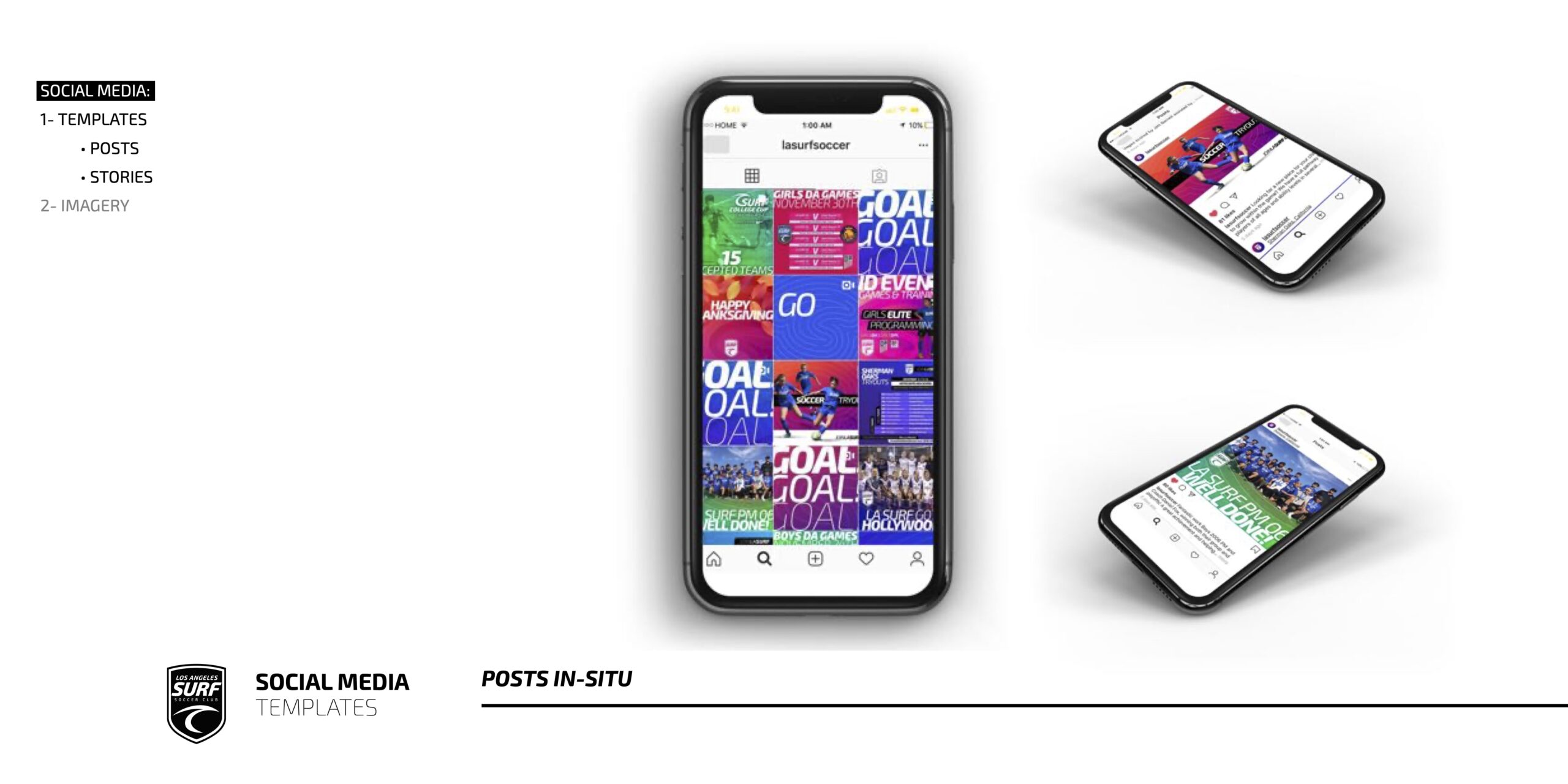
The final deliverables included social media templates, event branding examples, stationery, folders, wall signage, roll-up banners, presentation templates, badges, apparel, caps, phone covers, soccer balls, water bottles, mugs, pins, bags, stickers, and full campaign examples.
The result was a complete brand ecosystem that gave LA Surf a professional, scalable, and highly recognizable identity built for youth soccer, digital media, club growth, and long-term brand consistency.